
Creating a Power Apps Component Framework (PCF) component from scratch can significantly enhance the functionality and user experience of your Power Apps applications. This comprehensive guide will walk you through the process step-by-step, ensuring that even beginners can follow along. This Guide will also cover the common issues that we normally get while working with PCF.
Progress bar (Horizontal)
Progress bar (Circular)

What is PCF?
The Power Apps Component Framework (PCF) allows developers to create custom components that can be used in both model-driven and canvas apps. These components enable richer UI experiences and can interact seamlessly with the underlying data.
Prerequisites
Before you begin, ensure you have the following tools installed:
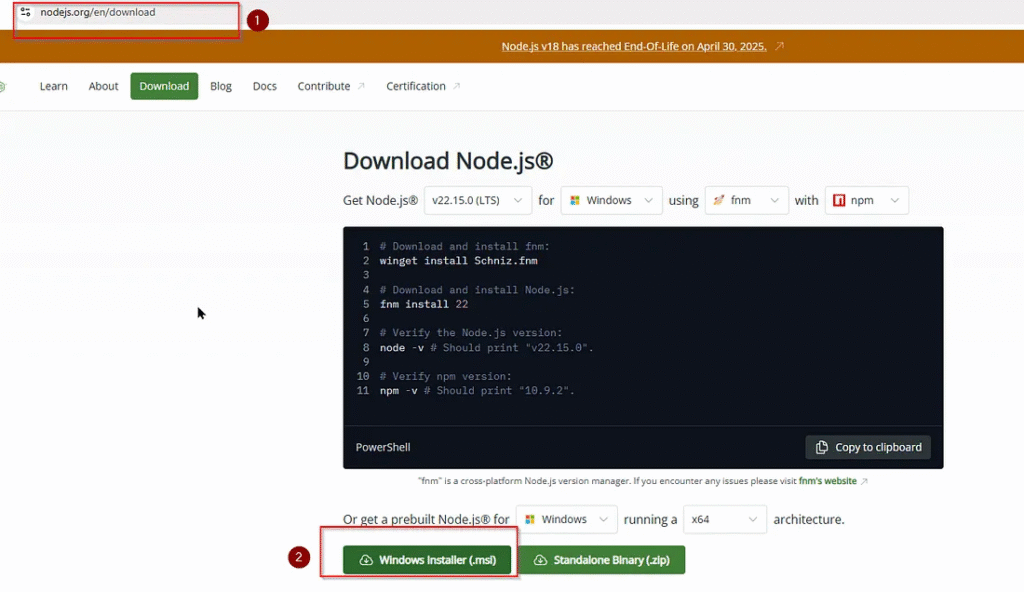
Node.js (LTS version): Essential for running JavaScript-based tools. You can download it from below. Since I am using windows machine, I will choose window Installer.
https://nodejs.org/en/download.
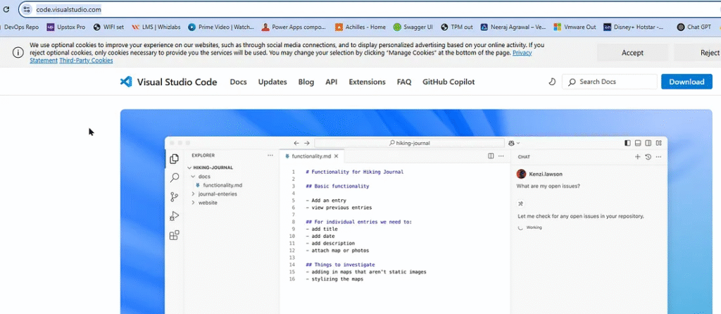
2. Visual Studio Code (VSCode): A lightweight code editor for development. If you dont have visual code set up then you can install it from here :
. NET Build Tools: Required for building the solution. (for production ready component)
4. Microsoft Power Platform CLI: (pac) Used for creating, building, and deploying PCF components. Use this link to get further :
https://learn.microsoft.com/en-us/power-platform/developer/howto/install-vs-code-extension
Once you have downloaded the necessary tools, now lets start with setting your development environment.
Step 1: Set Up Your Development Environment
About PCF : This PCF control takes a number between 0 and 100 and displays it as a styled progress bar with a label showing the percentage.
1: Create a Project Folder:
Since we are using visual studio code, lets first open vs code and then lets first create project folder with following command :
This command will create a new folder ‘Progressbar’ and cd command will move our terminal to that older location.
mkdir Progressbar
cd Progressbar
This is how our first command will look like.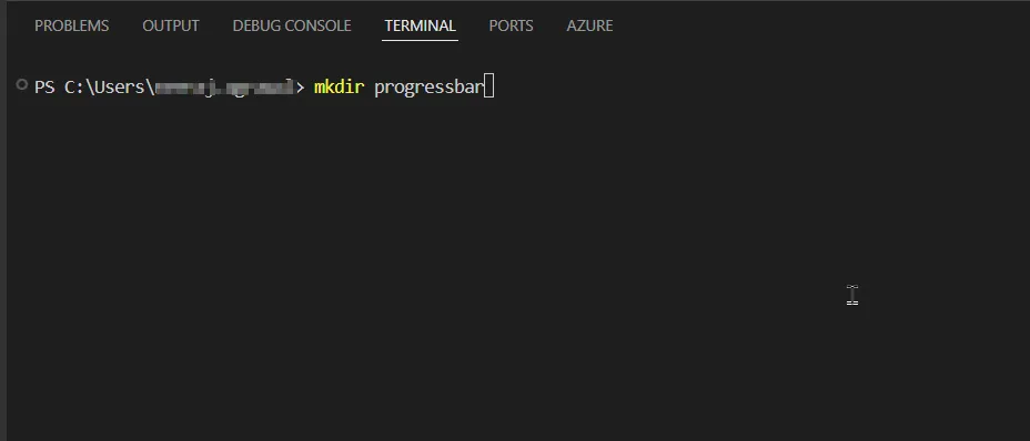
2. Initialize the PCF Project: Here we will use below command to create out namespace and define which template we want to create. In our case we will chose field template. For grid, you may choose ‘Data-set’ control.
For Field Template we will use –template field
pac pcf init --namespace progressbarNS --name Progressbar --template field
For dataset we use this –template dataset ( In this this is not needed, when you want to add your control in editable subgrid then you can use this option)
pac pcf init --namespace GridControlNS --name GridControlNeeraj --template dataset
Good to know you can install dependies directly in the same command by using — run-npm-install in the same command. In our demo, we will do it another step.
After putting this command in vs code, you will something like this in your vs code terminal which says that “Power Apps component framework project was successfully created in given location”.
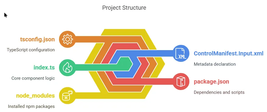
This creates a folder structure like this :
/Progressbar
|– ControlManifest.Input.xml
|– index.ts
|– tsconfig.json
|– package.json
Step 2: What’s in the Project?
Step 3: Install Dependencies
Run this command to install required packages: (If you have already used this command before in the step 1 then no need to run this again)
npm install
This commands installs packages listed in package.json, like:
@types/reacttypescriptpcf-scripts
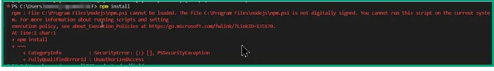
Please note if you run into below issue after pressing npm install
npm : File C:\Program Files\nodejs\npm.ps1 cannot be loaded. The file C:\Program Files\nodejs\npm.ps1 is not digitally signed. You cannot run this
script on the current system. For more information about running scripts and setting execution policy, see about_Execution_Policies at
https:/go.microsoft.com/fwlink/?LinkID=135170.
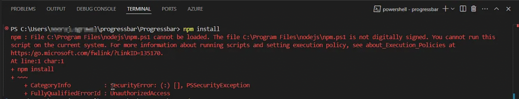
Then use below command to resolve the issue.
Set-ExecutionPolicy -Scope Process -ExecutionPolicy Bypass
Step 4: Add Component Logic
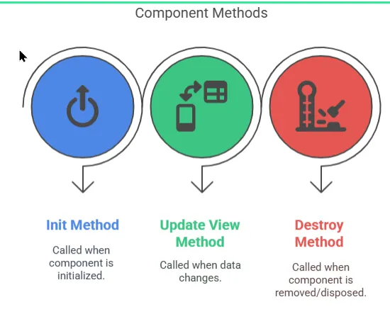
Your component needs 3 required methods:
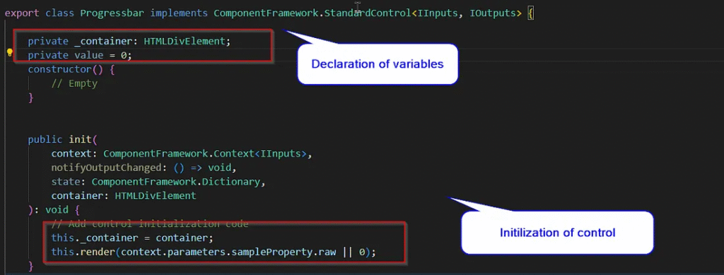
Edit index.ts just like shown below.
 private _container: HTMLDivElement;
 private value = 0;
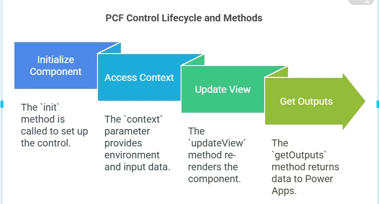
//init() -> This is a lifecycle method in a PCF control that gets called when the component is initialized.
public init(
        context: ComponentFramework.Context<IInputs>, //Provides access to the control's environment and input parameters.
        notifyOutputChanged: () => void, //A callback to notify Power Apps that the control’s output has changed (not used here).
        state: ComponentFramework.Dictionary, //Used to store control state (not used here).
        container: HTMLDivElement //The DOM element where the control will be rendered.
    ): void {
        // Adding code here.
        this._container = container;
        this.render(context.parameters.sampleProperty.raw || 0);
    }
//This function renders the progress bar UI based on the number passed in (value).
private render(value: number): void {

//Stores the current value.
        this.value = value;

//clears the existing content in the container.
        this._container.innerHTML = "";

//Clamps the input value between 0 and 100 (to ensure it stays within valid percentage bounds).

        const percentage = Math.min(Math.max(value, 0), 100); // Clamp to 0–100%


//Creates a div to act as the container for the progress bar.
const wrapper = document.createElement("div");
        wrapper.className = "progress-wrapper";

//Adds inner HTML that:
//Displays the percentage as text.
//Creates a background bar (progress-bar-bg).
//Fills a portion of it based on percentage (progress-bar-fill with inline width style).
        wrapper.innerHTML = `
            <div class="progress-title">${value}% Complete</div>
            <div class="progress-bar-bg">
                <div class="progress-bar-fill" style="width: ${percentage}%"></div>
            </div>
        `;

//Appends the constructed HTML to the container so it appears on the screen.
        this._container.appendChild(wrapper);
    }
This is how it looks like in my vs code.
Also update, updateView method just like below. This updates the progress bar whenever Power Apps tells the component something has changed.
//This method is called automatically by the Power Apps framework when something changes
public updateView(context: ComponentFramework.Context<IInputs>): void {
        // Gets the latest value of sampleProperty from the context
        //If it’s null or undefined, defaults to 0
        const newValue = context.parameters.sampleProperty.raw || 0;

//Calls the render() method with the new value to update the progress bar
        this.render(newValue);
    }

//This method is used to pass data back to Power Apps when the component wants to output a value.
public getOutputs(): IOutputs {
//Right now, it returns an empty object, which means this component doesn't output any data to Power Apps.
        return {};
    }
for more information, please check this
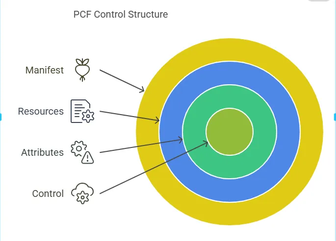
Lets also check how does our ControlManifest.Input.xml file looks like
Note : Constructor name here in Manifest file should match with index.ts file (export class Progressbar implements) otherwise you will run into error.
ControlManifest.Input file
<?xml version="1.0" encoding="utf-8" ?>
<manifest>
<control namespace="ProgressbarNS"
constructor="Progressbar"
version="1.0.0"
display-name-key="Progressbar"
description-key="Progressbar"
control-type="standard" >
<external-service-usage enabled="false">
</external-service-usage>
<!-- property node identifies a specific, configurable piece of data that the control expects from CDS -->
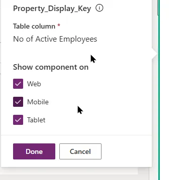
<property name="sampleProperty" display-name-key="Property_Display_Key" description-key="Property_Desc_Key" of-type="Whole.None" usage="bound" required="true" />
<resources>
<code path="index.ts" order="1"/>
<css path="style.css"/>
</resources>
</control>
</manifest>
Style.css ( Good to know here you can decide whether you want circle bar or horizontal bar)
Let’s go ahead and create the style.css for styling your progress bar, and also the necessary .resx files for localization (display names and descriptions). I have also included for progess bar in circular style.
This style.css will be at the same location as of your index.ts file. If you
.progress-wrapper {
    width: 100%;
    padding: 10px;
    font-family: "Segoe UI", sans-serif;
}

.progress-title {
    font-weight: 600;
    margin-bottom: 4px;
    color: #444;
    text-align: center;
}

.progress-bar-bg {
    width: 100%;
    height: 20px;
    background: #eee;
    border-radius: 25px;
    overflow: hidden;
    box-shadow: inset 0 0 5px #aaa;
}

.progress-bar-fill {
    height: 100%;
    background: linear-gradient(270deg, #00DBDE, #FC00FF);
    background-size: 400% 400%;
    animation: gradientMove 5s ease infinite;
    transition: width 0.5s ease-in-out;
    border-radius: 25px;
    box-shadow: 0 0 10px rgba(252, 0, 255, 0.6);
}

@keyframes gradientMove {
    0% { background-position: 0% 50%; }
    50% { background-position: 100% 50%; }
    100% { background-position: 0% 50%; }
}

.progress-circle {
    width: 100%;
    padding: 10px;
    font-family: "Segoe UI", Arial, sans-serif;
    box-sizing: border-box;
}

.circular-chart {
    display: none;
}

.progress-title {
    font-weight: 600;
    margin-bottom: 5px;
    font-size: 14px;
    text-align: center;
    color: #444;
}

.progress-bar-bg {
    width: 100%;
    height: 20px;
    background: #f0f0f0;
    border-radius: 30px;
    overflow: hidden;
    box-shadow: inset 0 1px 3px rgba(0, 0, 0, 0.2);
}

.progress-bar-fill {
    height: 100%;
    width: 0%;
    background: linear-gradient(270deg, #00dbde, #fc00ff);
    background-size: 400% 400%;
    animation: gradientMove 5s ease infinite;
    transition: width 0.8s ease-in-out;
    border-radius: 30px;
    box-shadow: 0 0 8px rgba(252, 0, 255, 0.6);
}
Step 5: Building the component
This does:
- Compiles TypeScript → JavaScript
- Validates the ControlManifest.Input.xml
- Prepares the component for packaging
If successful, you’ll see a out/ folder created.
npm run build
Note : If you want to test your component in local machine then use below command in your terminal. This will open your control in test harness so that you can verify your functionality. Good part with this command is you dont need to run npm build everytime to see your changes in local. (optional)
npm start watch
Good to know : One of the test harness limitations is that it does not load resource files, so you need to deploy the component to Dataverse to fully test your component. (As per Microsoft)
Step 6: Deployment (For testing purpose)
Step 6: Deploying and configuring in a model-driven app
Assuming you already have predefined publisher in dynamics 365 environment, we can authorize the Power platform CLI
pac auth create --url https://myorg.crm.dynamics.com
Here please replace the myorg.crm with your dynamics environment.
To deploy your code component, use:
Please use your publisher name instead of dev.
pac pcf push --publisher-prefix dev
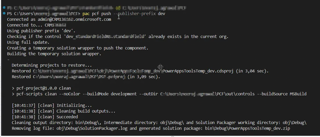
Once completed, this process creates a temporary solution named PowerAppTools_Progressbar in your environment.
Step 7: Adding PCF component to your field in Account for Model driven app
Next, add the code component to the Account form by following steps.
- Go to https://make.powerapps.com/
- Select your environment in the top right hand side.
- Select your desired solution, I will choose Account entity for example.
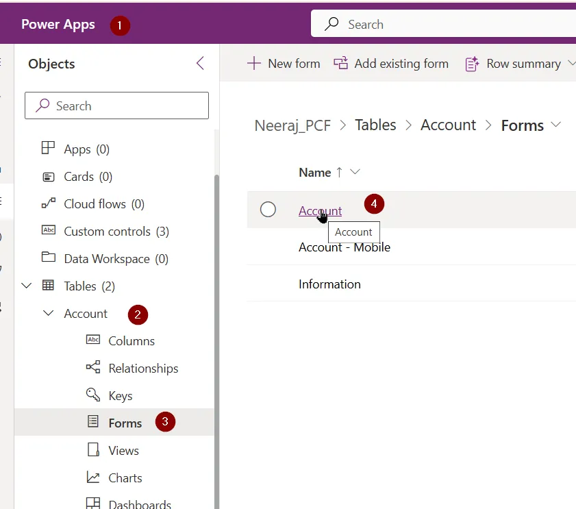
4. Select your field on the form where you would like to see the control
5. Click on components as shown below.
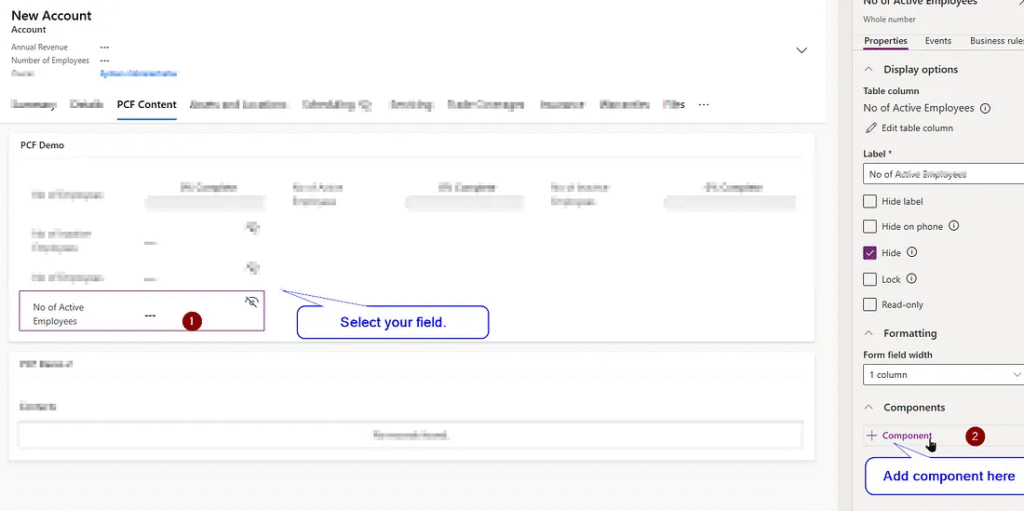
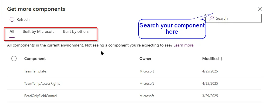
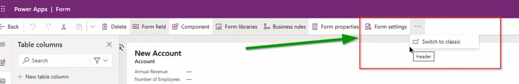
6. Sometimes if your control is not showing here then you may need to switch to old classic editor to add the control. Microsoft mentioned that In the future, the classic editor will not be needed to configure code components on model-driven apps forms. so just incase, if you dont find the control, switch to classic editor.
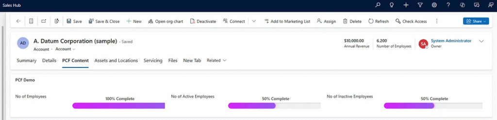
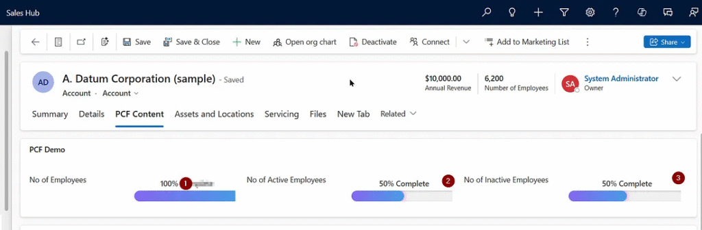
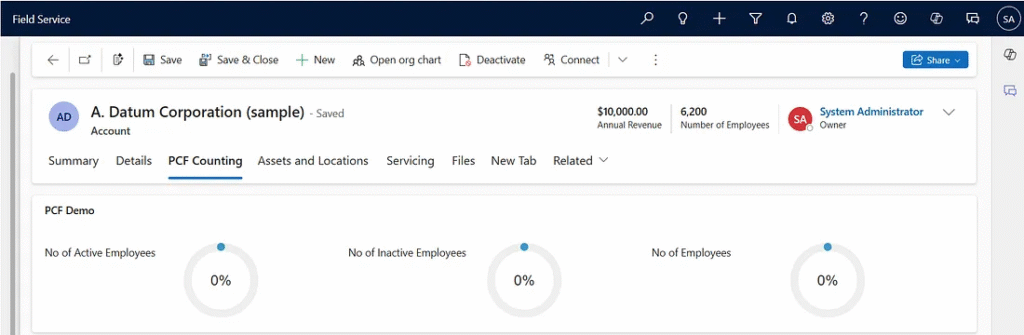
7. Finally it will look like this
Horizontal progress bar

I have also adjusted a bit of code to show how does it look like in circle bar
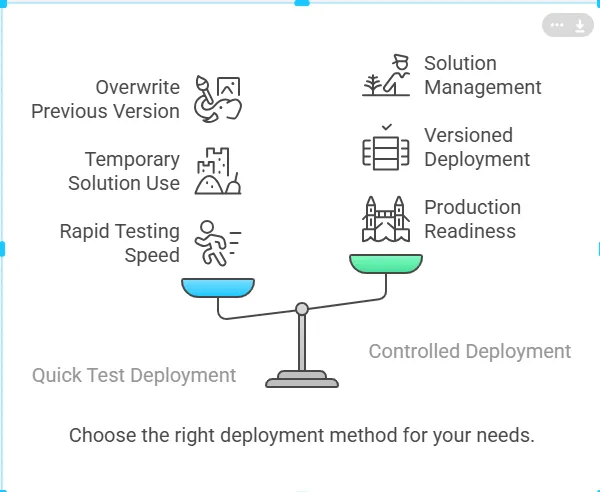
Extras : Controlled Deployment (via Solution Zip) for Production or Versioned Deployments
Controlled Deployment (via Solution Zip) for Production or Versioned Deployments
In addition to the standard development workflow, another approach to deploying PCF controls is controlled deployment via a solution zip. This method is recommended for production environments or when you need to version your deployments in a controlled manner.
Controlled deployment involves using the MSBuild command-line tool to bundle your control and other solution components into a solution zip file. This zip file can then be easily imported and deployed to Dataverse (formerly known as the Common Data Service), ensuring consistency across environments.
Why Choose Controlled Deployment?
- Versioning: Allows you to version your control and its related components, making it easier to manage updates and ensure backward compatibility.
- Production-Ready: Ensures that the control is deployed in a clean, reliable, and versioned manner, minimizing the risks associated with manual deployments.
- Consistency: This method is ideal for scenarios where you need a repeatable deployment process, such as DevOps pipelines or when deploying to multiple environments (e.g., from development to staging to production).
Steps Involved:
- Build the Solution using the
msbuildcommand, which compiles and packages the solution files into a zip. - Deploy the Zip file into your Dataverse environment using the Power Platform Admin Center or through other supported deployment tools.
- Version Control: Keep track of changes and updates to the solution by managing version numbers in the manifest and deployment process.
pac solution add-reference --path <path to your folder>
msbuild /t:restore
msbuild
Tip: Use Versioning
If you want to update the existing PCF control then update the version in ControlManifest.Input.xml:<version>1.0.1</version>
Common Issues and its Resolutions
Listing down some common issues here that you may get while setting up.
Issue 1 : The file C:\Program Files\nodejs\npm.ps1 is not digitally signed. You cannot run this script on the current system. For more information about running scripts and setting
Resolution : Use this command in your terminal
Set-ExecutionPolicy -Scope Process -ExecutionPolicy Bypass
Issue 2 : Error Can not find module ‘ajv/dist/compile/codegen’.
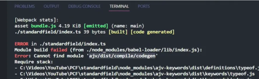
Resolution : Use this command in your terminal
npm install --save-dev ajv
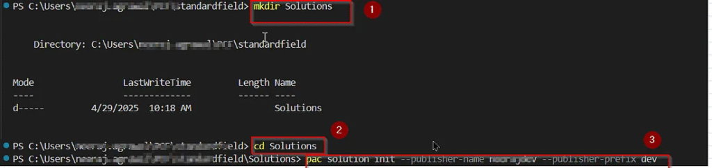
Issue 3 : While using pac solution add reference command , you can run into this Error: The value passed to ‘ — path’ is invalid. No supported project type found in path C:\PCF\standardfield.
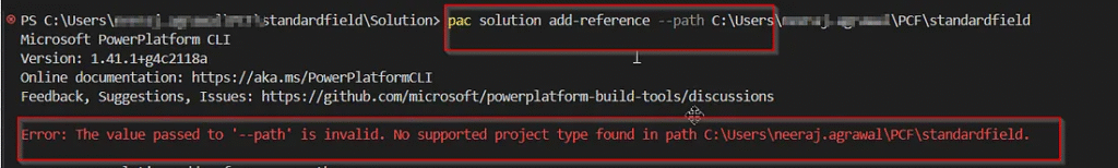
Resolution : Create new folder and then add your solution reference there.
Example :
C:\Users\standardfield> cd Solutions (basically going to new folder path that you have created)
C:\Users\standardfield\Solutions> pac solution init - publisher-name testingpcf - publisher-prefix dev
Issue 4 : Error: Argument — publisher-prefix has incorrect length. The length of argument should be between 2 and 8.
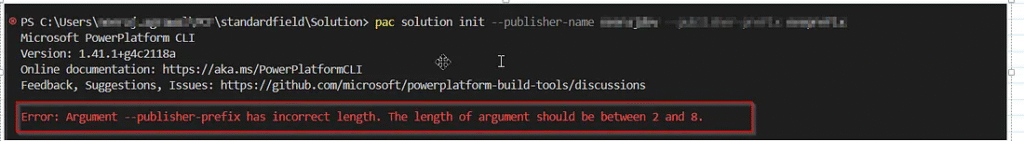
Resolution : Use short name for prefix.
Issue 5 : Error: CDS project creation failed. The current directory already contains a project. Please create a new directory and retry the operation.
Resolution : Create new folder just like Issue 3 resolution and then use reference. (shown below)
Issue 6 : msbuild : The term ‘msbuild’ is not recognized as the name of a cmdlet, function, script file, or operable program. Check the spelling of the name,
or if a path was included, verify that the path is correct and try again.
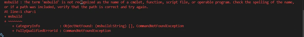
Resolution : Use Developer command prompt VS 20se the same command by going to your pcf location.
Issue 7 : Power Apps component framework project file with extension pcfproj was not found in the directory C:\Users\neeraj.agrawal\PCF\standardfield.

Resolution : Fix : go back to root where pcfproj exists using this command.
C:\Users\user\PCF\standardfield>cd ..
cd C:\Users\user\PCF (this is my root location where pcf proj is present)
Additional tips
- Use PCF Custom Control Builder in XRMTool box to have better experience as show in this blog https://nishantrana.me/2019/10/22/using-pcf-custom-control-builder-xrmtoolbox-plugin-to-update-existing-control-in-dynamics-365-powerapps/
- Keep changing the version in control manifest files if you have new changes. For testing purpose, npm run build and pac pcf push commands are enough.
- You can learn more on PCF from here : https://learn.microsoft.com/en-us/power-apps/developer/component-framework/overview
- Get more sample components from here : https://github.com/microsoft/PowerApps-Samples/tree/master/component-framework
- Also check PCF gallery for more styled components https://pcf.gallery/

Dynamics 365 Senior Consultant with deep expertise in customization, optimization, and integrations. Committed to giving back to the CRM community by breaking down complex concepts, sharing real-world insights, and helping others succeed with Dynamics 365 & Azure.
No responses yet